UX Research & Redesign of HDFC's mobile banking experience
Forrester’s Global mobile banking report ranked Indian mobile banking apps poorly in comparison to the global average. HDFC's score of a 48 on 100 sparked an opportunity to evaluate and improve its mobile banking functionality

User Research drove the redesign phase. It helped us understand:
1. The users and their needs,
2. How they currently approach the problem
3. Their mental models of the solution
4. The way they perceived information
User Personas

The key personas focussed on those least resistant to mobile banking. The redesign prioritised these users and their needs
What are their needs with mobile banking? What do they typically do within the app?
We designed a survey to analyse mobile banking behavior and the results observed from around ~100 entries were as follows:

Netbanking was the most frequently used medium for banking while none of the users who took the survey opted for Banking/ ATM as their most frequently used medium

User focus in mobile banking was more on money management than on wealth and investment management
Their key activities on the app helped prioritise the tasks on the application.
INSIGHT: The average user’s mobile banking priorities were focused more on money management than wealth management.
User Research, Findings & Data
The two key parameters we decided on for segmentation were the user’s financial security and familiarity with technology.

A participant’s results for the card sorting exercise
Information Architecture & Card Sorting
A card sorting exercise with over 20 participants revealed how users categorized information. This helped shape the information architecture. A key finding was that a proportion of participants grouped deposits and mutual funds together as wealth management, while several banking applications typically categorized deposits under account information. The information architecture had to balance the user’s mental model, without compromising on the standard norms of categorizing information.
Reviewing the User Experience
Log In:

One common complaint on the App Store was the inability to log in via the app. This was due to password expiry. While the website notifies the user prompting them to reset it, the app doesn’t. Leaving the users clueless until they got on the website
Inability to log in due to password expiry
My Menu:

Fixed Deposit Flow:
The app requests the user to input the deposit amount before generating the rules that determine the minimum deposit amount and duration. This could lead to the user re-entering the amount based on the displayed rules. The ideal flow would be to educate the user on the rules before they enter the amount and duration.


Prompting the user when they enter an amount below the minimum amount can offer instant feedback and improve the user experience
Fund Transfer Flow
The current fund transfer flow on the app is highly convenient for a user looking to make an urgent transaction. However, there are two key validations in the process:
a) Is it the actual user looking to make the transfer?
b) Is the user certain of the transfer they’re trying to make?
Frequently made fund transfers often become habitual i.e ingrained in our muscle memory. While this makes it easier for the user, it can often result in the user easily accomplishing the wrong task.
Friction in the user experience (especially with fintech) could be to the user’s advantage, especially if it’s while introducing an additional layer of validation in the payment process, a one-time password for example.

User review on accomplishing a wrong task
The current approach of categorising information into ‘Transact’, ‘Enquire’ and ‘Request’ although theoretically accurate does not prioritise the user’s flow of performing tasks and organising information.
Fund Transfer Flow


Proposed flow for Fixed deposit generates the rules prior to user input

Categorising information into ‘Transact’, ‘Enquire’ and ‘Request’ although technically accurate did not align with the user’s flow of performing tasks and organising information

Red Routes for prioritising tasks across frequency of times and people who perform them
Features such as Bill payments, Fund transfer and viewing account details are crucial for money management and need to be provided up-front, whereas features like managing deposits, mutual funds that relate to wealth management can be disclosed progressively .
The Information Architecture took into account the tasks users wanted to primarily perform, the categories they perceived as well as the norms of categorizing banking features.

Reorganised categories of information
The Wireframing process involved putting together all the redesigned functionalities and flows on the mobile screen. This was the final, iterative check-point on how the workflow would translate onto the screens, before delving into how the screens would look.

Wireframes using Figma
The Redesign
Red Routes prioritise tasks by evaluating each task on how many users perform it and how many times they perform it. This helps identify the crucial tasks that should be provided upfront and the good to have tasks that can be discovered gradually through progressive disclosure.
User Interface Design
Once the wireframes were finalised, we moved on to the User Interface design. Selection of colours, iconization and typographical choices were centred around the brand identity and functionality.

The Redesigned Sign in screen:
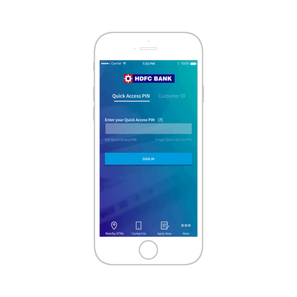
Redesigned Sign in screen
The redesigned navigation menu prioritises the primary money management tasks that users perform. Secondary features are progressively disclosed within the ‘More’ section.
Redesigned Navigation Menu
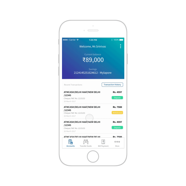
Account Screen: The primary information made visible on the account screen is the balance and the recent transactions. The screen provides access to transaction history- where transactions can be filtered by type, time-frame and amount.
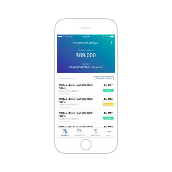
Prioritising balance amount and recent transactions on the account screen with progressive disclosure to access transaction history by type, amount and time-frame
Transfer funds process incorporating one-time password verification

Additional layer of OTP validation in fund transfer
Final Designed Screens


